Friday, December 21, 2012

Hendrick van Vliet Rome Italy


Cari Amici (Dear Friends),

Inside the Vermeer exhibit that I wrote about last time, “Vermeer: il secolo d’oro dell’arte olandese” ("Vermeer: the Golden Age of Dutch Art"), was a painting by Hendrick van Vliet. He did a series of paintings of the Nieuwe Kerk (new church) in Delft in The Netherlands and oddly, I was not able to find a proper image of this particular painting online. So you are stuck with my “illegal snapshot.”

I tried to learn what I could from seeing these paintings in person, although I must admit that I had not seen most of them in books. I need to get out more! Seriously, though, I was moving slower than my friends were because I was taking time to really look at the works and make decisions for myself on how each may have been done and what, if anything I would change TODAY if I tried to copy these paintings.

At some point, my friend Anne Berit walked back to me and showed me her favorite pair of paintings. So, then I led her to a part earlier in the exhibit to this one. I told her what I enjoyed about this painting, as well as what I would change. It is a strange thing to crit a work of art when one can clearly see the skills of the artists.

But, here goes: I like the lighting on this painting. It definitely reads from left to right. The shapes are interesting and the red cape is placed well, with enough red throughout the composition to give some color harmony to the work. The people are interacting with one another and despite the hard edges everywhere (mentioned in my last blog entry), the figures are believable enough. And I love it that dogs are inside the church! And not just because they are well done and used compositionally to point to the interior of the church.

However, what first drew my attention to this painting was that the shadow on the hat of the man with the red cape is way too dark, or the other parts of his person are too light. I think the high contrast on the main figure’s head is a good idea since the eye is drawn to this first. So, in this case, I would have chosen to make PARTS of the shadows in the cape darker, but certainly the back side of the man should be darker to show that his back is away from the light. Because of this disparity, I do not see this man as three-dimensional.

But back to something positive, I really enjoy how clever the artist was to handle the parallel columns in different ways. Variety is infinitely more interesting than symmetry, although one needs the latter to emphasize the former. Can you imagine how the painting would feel if both columns were in the same light, with the same rendering of the roundness from light side to dark side?

It is brilliant that the artist left one column in full light, while the other not only had an overall shadow falling on it, but also some specific shadows that break up the light shape on the top left of the column (on the right). We do not see in the painting what would cause the shadows, but their presence creates interest that is subtle enough to not take us away from the overall impression of the painting.

The artist has done the same with the floor, breaking up the grey pavement with light shapes. The light from windows (not presented on canvas) that falls onto the lower left of the floor in the painting serve to point into the composition, as well as underline the group of figures above it, drawing attention to this corner and activity in the painting. And while one could argue that perhaps all of those lights and shadows did exist and the artist simply reproduced them, I would argue, ok, but then do not discount the artistry of the architect! Like a sculptor, a good architect studies the light of the site for which he designs and plans accordingly.

It is an interesting exercise to look at compositions and notice what shapes repeat, giving us a sense of balance and tranquility versus how the repetition is kept from becoming boring by adding subtle differences to the symmetry. If you have not tried it (lately), please do. It is by an artist’s design!

If you would like to see more of the exhibit, here is another link: http://www.essentialvermeer.com/delft/delft_today/oude_and_nieuwe.html

Happy Winter Solstice and apparently the End of the World

Wednesday, December 19, 2012

Vermeer Exhibition Rome Italy


Cari Amici (Dear Friends),

We went to Roma recently to see the exhibit “Vermeer: il secolo d’oro dell’arte olandese” ("Vermeer: the Golden Age of Dutch Art"), although being the multi-taskers that we all are, Vermeer was not the only reason to go to Roma (as hopefully you gathered from my recent blog posts). The exhibit was inside the Quirinale in the central part of the city and is easy to find.

I enjoyed the display. Each painting was hung on its own colored wall. There was a warm feel to the room by the variety of colors chosen and the personal attention given to each work. The artist’s name was written at the top of each wall, except Vermeer’s. His purple walls signified royalty, and like royalty, one need not be given the royal person’s name. One is expected to know these things already.

It is quite possible that I “people watch” as much as I look at the art on the walls. I was enchanted by a father who took his young son to each painting. They spoke at length about each one, longer than most people generally stand in front of a work of art. They are in the foreground of this image I secretly took of one of the Vermeer’s paintings on exhibit. (See the purple wall?) Until someone can explain how my flash-less, noiseless behavior is hurting the art or the viewers of it, I will continue to take images without permission. Most of the time, what I am interested in is not something that I will find on a postcard, or even sometimes in the catalog. And there you have it: another human behavior noted. We all justify our own actions, good or “bad.”

This painting of the girl in the red hat by Johannes Vermeer is the one that is being used on all the publicity. It is quite beautiful with a wonderful use of color and, of course, light. But I had not expected it to be so small, perhaps 8 x 6 inches? It is no surprise that the qualities that I enjoyed about the Vermeers were the soft edges, atmosphere, and the dramatically soft light.

As my friend Roberto pointed out, “The Lute Player” (shown here) is lovely because of its intimacy. The majority of the paintings in this exhibit were by contemporaries or perhaps students or followers of Vermeer. However, most were not to my taste. In general, one could appreciate the skills and technique involved. Painting is, after all, a difficult thing to do well. Besides the occasional poor drawing skills, the edges were all so sharp that I wondered if these artworks were painted in the fast drying egg tempera. When edges are consistently sharp, the viewer can have the impression that the work was a bit formulaic, not unlike a paint-by-number situation, although I am not intending to be so ugly.

I do not know art history as well as I should, I suppose, but it seems to me that the Dutch were interested in portraying their own contemporary Dutch life sooner than many other painters had moved away from mythological or religious concepts. I enjoyed how often dogs were painted into these scenes. I miss my dog Zac a lot and remember well how important these companions are in our daily lives. I was also amused by the artists who wanted us to see dogs peeing, even inside of a church!

The painting that I found myself drawn to again and again was the self-portrait of Carel Fabritius. A student of Rembrandt and tutor to Vermeer, he died at a horribly young age, in the famous Delft Explosion. Carel Fabritius died of his injuries after a gunpowder store exploded. Most of his paintings were lost as well.

This self portrait from 1650 (four years before his death) is beautifully done and we studied it for a long while. But what is up with that hat on the right side? Seriously, had it made sense and been symmetrical with the rest of the form of the hat, it would not be nearly as interesting a shape! How does one invent such joys? Also, as I commented to Roberto, the eyes do not match up as we are taught to do, but they work. However, I do not think the eyes would have worked if the shoulders did not work with them. There is a quality – je ne sais quoi – that is consistent in the body language. It is the illusive thing that we artists want to capture… the essence of the emotion in the gesture. Hmmm….

The exhibit “Vermeer: il secolo d’oro dell’arte olandese” ("Vermeer: the Golden Age of Dutch Art") continues at the Quirinale in central Rome until 20 January 2013.

Here are some lovely large images from the Vermeer exhibit, including a study that Vermeer did from a Florentine artist. It is interesting to see the changes that he made to the original: https://art4arte.wordpress.com/tag/jan-van-der-heyden/

You might also enjoy this link: http://www.alaintruong.com/tag/Carel%20Fabritius.

Buon compleanno, Roberto! Your enthusiasm is contagious and pure.

P.S. These latter images are some of the views I had while inside the Quirinale in Roma, Italy.

Tuesday, December 18, 2012

Bone Crypt of Friars Cappuccini Rome Italy

Cari Amici (Dear Friends),

Back in the summer of 2009, I visited Austria and wrote about the Beinhaus (The Bone House) in a Gothic church in Hallstatt.

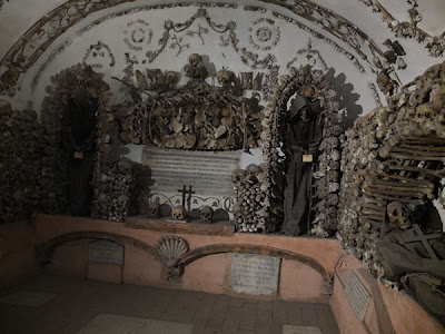
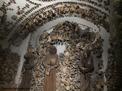
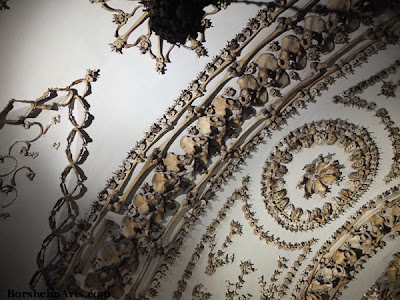
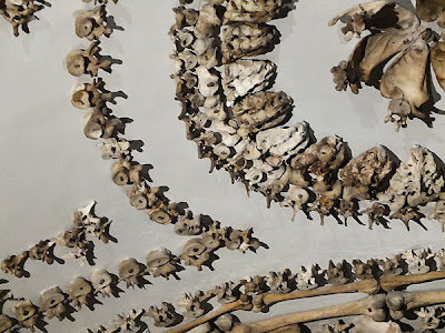
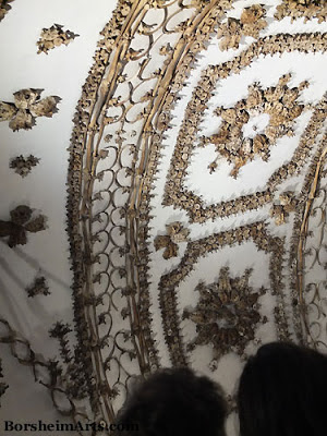
In my recent trip to Roma, my friends and I visited the Museo Frati Cappuccini described in my last post. Once you get past all of the traditional museum stuff, you enter . . . La Cripta dei Cappuccini aka Cripta Ossario (bone crypt).

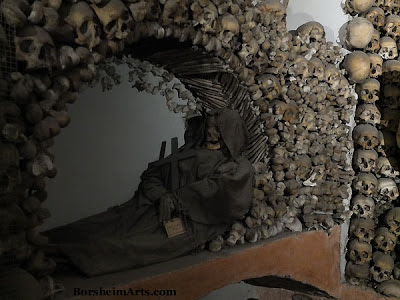
I was asked by my Austrian friend years ago not to take photos inside the Beinhaus out of respect for the dead, but that seems different from staff trying to sell postcard images, so I share with you a few snapshots I snuck of this amazing way to … honor the dead. If you can step back about the subject matter for just a moment, think abstractly, and take in the shapes, I hope you will see that there is a grace and elegance to the lace-like designs.

I find that the scientific and curious part of my brain takes over in situations like this. I am not sure that I think it is offensive to arrange bones in any manner once people are dead (or to photograph such artistic compositions). Unless, of course, you killed them. I am not convinced that we need our bodies after death. I suspect that our energy “simply” changes. In any event, I doubt we need our body parts after death and I tend to think it is more important for those that go on living to express their grief and love in a way that comforts them and acknowledges cherished memories of another. And I am not sure what the answer is to the question of how one arrives at obtaining clean bones for such cryptic compositions.

Also, I am fascinated continually by the design of our bodies. Our bones are very specific shapes even when they vary for individuality. They curve for engineering purposes and are relatively strong; yet lightweight for the tasks they have been given. I find it fascinating to see bones arranged into delicate shapes and patterns that are aesthetically lovely. I believe that those who are responsible for creating this crypt of bones did so out of a deep-felt passion and love.

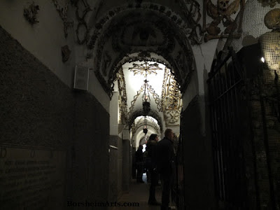
Visit the Crypt in Rome, Italy:
La Cripta dei Cappuccini
Chiesa dell'Immacolata in via V. Veneto, 27
Convento dei frati cappuccini – Roma
Here is another link with a cool image of the crypt..

P.S. On a happier note, I recently successfully applied to renew my “Permesso di Soggiorno” (permission to stay in Italy for another year). This was only one step, but I now have an appointment with the Questura (Italian immigration police) in January. So, I can legally spend the holidays here and am already painting on several things and happy about it.


Monday, December 17, 2012

Convento dei frati cappuccini Rome Italy

Cari Amici (Dear Friends),

I recently went to Roma to see the Vermeer exhibit with three other friends. It was wonderful to have such a small group so that we could move more efficiently and see more things. After looking at all the art available to us in the National Gallery of Ancient Art inside the Palazzo Barberini, we walked over to Via Veneto 27. Here is the Chiesa di Santa Maria Immacolata. While the church was closed during our visit, we entered the part of the building that is the Museo Frati Cappuccini.

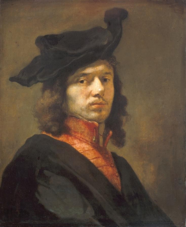
This museum houses items you would expect in a friar’s museum, mostly objects from the daily lives of the friar, from clothing to clocks and more. There is not a bad collection of paintings, including one from Guido Reni. The painting shown here of St. Francis in prayer was recently attributed to Caravaggio. It is not a bad painting, but like St. Francis himself, perhaps, the painting seemed a little tame to me.

This last image shows my friends and fellow artists looking at the metal whips the friars made for self-flagellation. If you think that is fun, wait until the next post. It gets better!